startup spresto
Redesigning Browsing IA for Usability & Scalability
How can we Simplify browsing navigation to improve scalability & usability while highlighting the unique selling point (USP) in alignment with the app's early-stage lifecycle?
role
UX Designer
timeline
3 Weeks
Apr 2022 ~ May 2022
Design
User Flows
Wireframing
Prototyping
Visual/UI Design
Research
Usability Testing
Concept Testing
Competitive Analysis
team
2 UX Designers
(including me)
3 Developers
1 Technical PM
to be

USP visibility through
“Safety” 3rd tab

Merged browsing tabs
& Search bar integration

Map/List view toggle on all browsing screens

Simplified navigation with reduced depths (max 5 -> 3)
as is
No visibility of
USP (privacy solutions)


2 browsing tabs displaying
nearly identical search results
due to limited hotel supply

Inconsistent & missing
search bar in Depth 1

Limited Map View Accessibility, making users navigation one level deeper to access it

Excessive navigation Depths (up to 5 levels), worsened by a hidden navigation menu
overview
As the Product Manager for a small engineer-centric team with just 1 designer, I took on both strategic and hands-on UX Design responsibilities to launch Check-In, a hotel booking platform with a unique focus on security/privacy solutions, including a spycam detection feature. While the CEO supported my proposal on making the USP (security/privacy solutions) visible as a menu tab, I identified deeper navigation challenges that required a complete Information Architecture (IA) overhaul.
I created wireframes, addressing usability issues while ensuring scalability, to secure approval for the IA redesign. I collaborated with 1 other UX Designer. While she focused on the new “Safety” tab's visual design, I led the end-to-end design of the IA navigation that simplified user journeys and highlighted our USP.
This project also became a turning point, as we demonstrated the need for a design system and style guide, successfully proving their value to the engineering team and CEO and kicking off the initiative for a more unified platform.
impact
92%
SUS in post-redesign testing (up from 68% pre-redesign).
15x
Increase in engagement with the unique selling point (spycam detection),
which was previously buried.
2
Reduced navigation depth
from 3+ to 2.

the story begins...
“No one knows about our unique selling point (USP) because it’s buried,” I stated during a weekly standup.
Only 6% of users were clicking on our spycam detection feature—a key differentiator hidden behind multiple layers. The CEO agreed it needed better visibility and approved the idea of adding it as a menu tab.
The CEO liked my proposal of incorporating the USP as a new menu tab, but I knew this alone wouldn’t solve the problem.
Our team were aware of potential inconsistencies and redundancies in the browsing navigation tabs. However, usability & concept testing revealed deeper issues, i.e., excessive depth, redundant results, and inconsistent access to features. These findings led me to explore whether the 2 tabs could be combined into 1, simplifying navigation and making room for the USP tab.
How might we
Simplify browsing navigation to improve scalability & usability while
highlighting the unique selling point (USP) in alignment with
the app's early-stage lifecycle?
findings from concept & usability testing
Low USP Engagement
Severity: High
Low Discoverability
Only 6% users clicked the spycam detection feature buried in “my profile” - “more”. Most users were unaware of the existence of our privacy solutions.
Severity: High
High Engagement Barrier
The spycam detection feature was visible on the home screen only to users who had already booked hotels. This created an unrealistic expectation of user engagement, particularly at the product's early stage when building awareness was crucial.
Navigation IA Usability Issues
Severity: High
Perceived Redundancy Due to Limited Hotel Supply
Following the industry-standard approach with “Nearby” (browse hotels nearby) and “Region” (browse by regions, broader areas) tabs resulted in overlapping search results due to limited hotel supply, creating a feeling of emptiness.
“I expected 'Nearby' to show closer options, but it showed the same results as browsing by city, exposing the platform's limited supply.”
Severity: High
limited search access
Lack of persistent search functionality across navigation depths made it combursome to compare hotel results.
Severity: High
Excessive navigation depth
Users struggled with overly deep navigation, as hidden menu tabs and 3+ levels created unnecessary complexity and confusion.
“I had to press back multiple times to get back to the home screen.”
inconsistent iconography
Duplicate filter icons with identical functionality and four different location icons, creating confusion and making it difficult to distinguish their purposes.
Map View Reliance
Users frequently relied on map views but found them available inconsistently across search screens.
“When booking motels nearby, I use map view to check distances but often have to click each hotel to see the exact location.”
how might we
Balance USP visibility with usability?
Simplify browsing navigation IA while ensuring scalability?
Highlight the USP while keeping navigation clean and intuitive?
Simplify the IA to improve usability while ensuring scalability?
Reduce redundancy between 2 menu tabs, "Nearby" and "Region," to enhance value?
Standardize filters, views, and sorting options for a consistent experience?
Make the map view more accessible across all screens?

Strategy
decision point
To maintain a total of 5 tabs,
consolidate the ‘Nearby’ and ‘Region’ tabs,
making room for the USP tab while
reducing the perception of limited hotel supply.
This decision prioritized highlighting the USP as a key product differentiator in the app’s early stage while ensuring navigation remained simple and scalable for future growth.
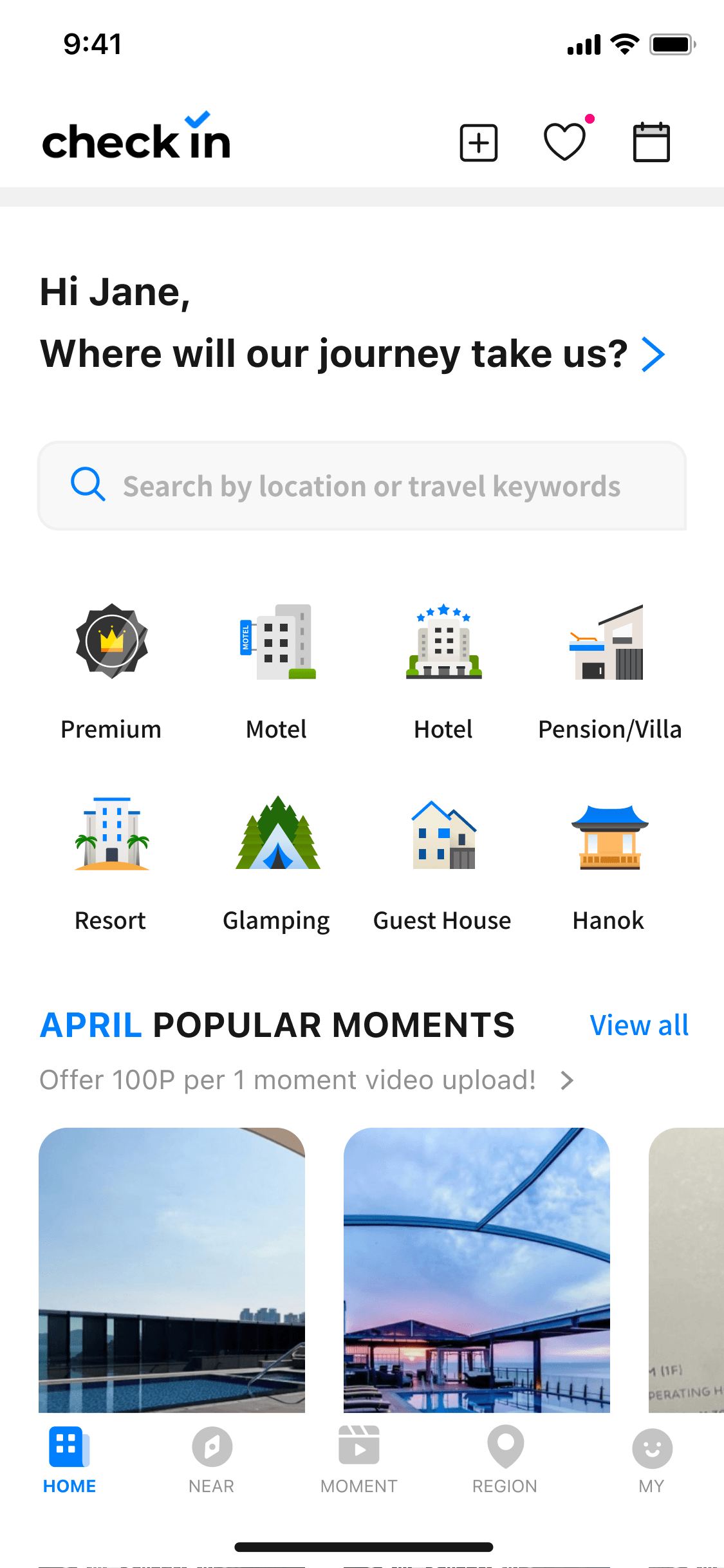
Highlights the USP immediately.
Requires minimal IA changes, allowing a quick implementation.
Aligns with best practices by keeping the total number of tabs at 5.
Reduces perception of limited hotel supply by presenting a more unified browsing option.
Creates space for the USP tab.
Improve usability & scalability.
Pros
Requires effort to restructure the IA.
Potential short-term confusion for users accustomed to separate tabs,
a conventional IA.
Requires testing to ensure merged functionality meets user needs.
Cluttered navigation — not ideal for usability or industry standards.
Perceived redundancy in 2 tabs (“nearby”, “region”) remains due to limited hotel supply.
Risks overwhelming users.
Cons
Add a 6th tab for the USP
Consolidate 'Nearby' and 'Region' Tabs to Add the USP Tab


6 tabs for now until I overhaul the IA...
Although the CEO approved the need for an IA overhaul, we agreed that implementing the USP tab was the top priority, even if
it temporarily resulted in 6 tabs.
He entrusted me with the authority to reorganize the IA, including exploring the possibility of combining tabs.
design strategy
Reduce navigation depths & perception of excessive depth by ensuring consistent access to key features (e.g., search bar, map/list view, nav bar).
Through an audit of our design and 20+ competitors analysis,
I found that the conventional navigation depth typically remains at 2 levels until the user clicks on hotel details, whereas our current design extends to 4 levels.

audit on the original design

Design Solutions

design solution #1
Merge 'Near' and 'Region' menu tabs to centralize navigation
Consolidated the 'Nearby' and 'Region' tabs to simplify navigation and resolve redundancies, as both displayed nearly identical results due to limited hotel supply.
Created space for the USP 'Safety' tab, maintaining a clean structure with a total of 5 tabs.
Positioned the IA for scalability, ensuring the navigation could accommodate future listings as the platform grows.

design solution #2
Add a toggle for seamless switching between Map & List views
across all hotel browsing screens
Addressed inconsistent map view availability.
Made comparisons easier on all hotel results screens.


design solution #3
Implement Persistent Search Bar
Improved search discoverability and reduced confusion as users could easily locate such features across 1-2 depths of “Near” tab screens.


Achievements
Achievement #1
Locate the USP (Hotel Privacy Solutions)
in the 3rd tab


Achievement #2
Reduced Depths (4 → 2)
to View Hotel List Locations
Improved depth awareness, user orientation & backtracking, reducing task time to return to the home screen by 64% (28 sec -> 10 sec).

before

after
achievement #3
Foundation for a Design System & Style Guide
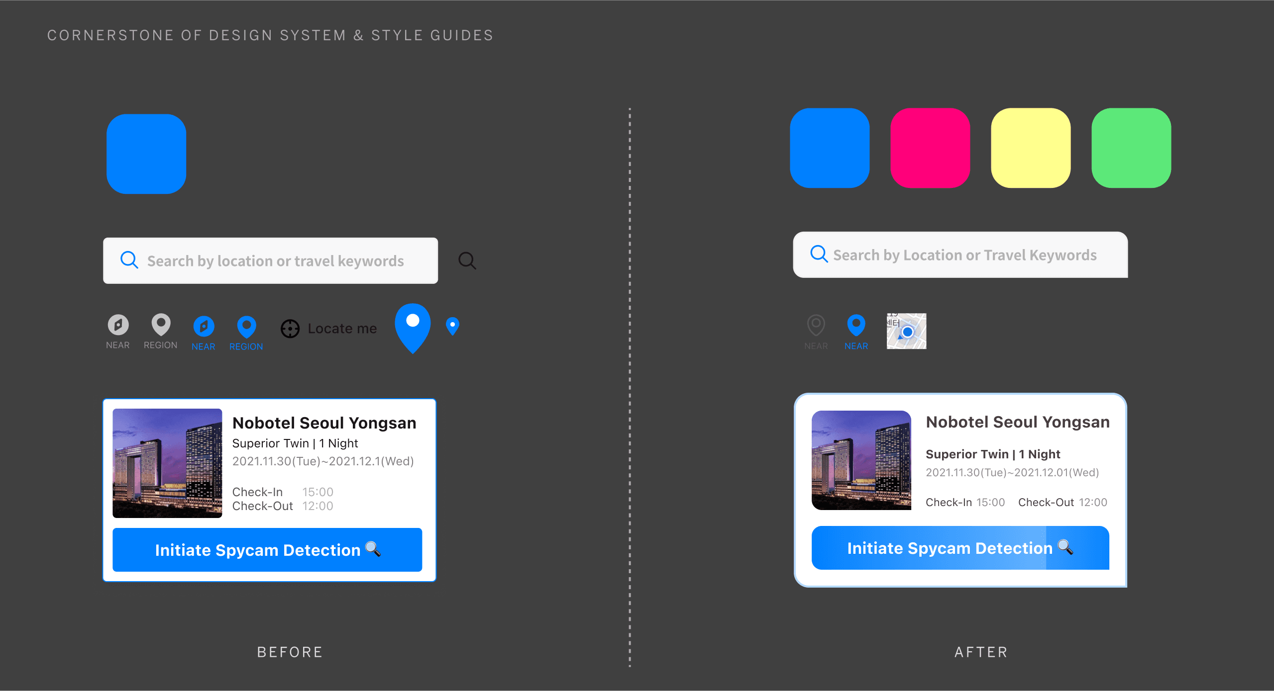
As part of the redesign, I addressed major UI inconsistencies such as mismatched icons (e.g., search bar and map icons), uneven padding, and inconsistent font sizes. These design flaws highlighted the urgent need for a design system and style guide to ensure visual consistency and reduce development inefficiencies.
Without a design framework in place & especially with the original designer no longer at the company, the redesign was harder than starting from scratch due to inconsistent UI elements and frequent developer questions about padding and spacing. I convinced the engineering team and CEO to adopt a design system by showing how standardized components in Figma would streamline development and ensure consistency.
navigation
connect with me
© 2024 Yunbin Bae
based in USA